Puercoespín Editores
2014
-
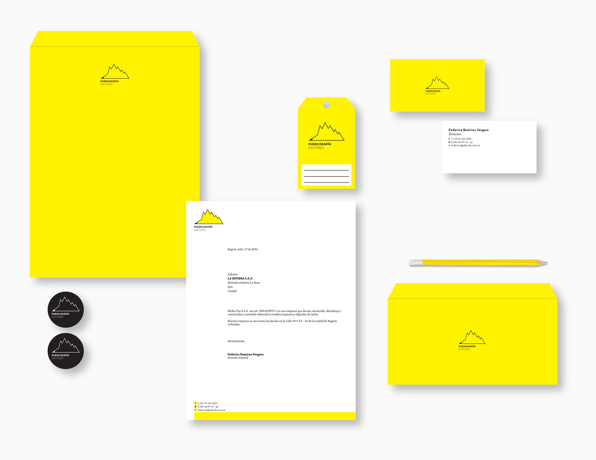
When Puercoespín Publishers was created its growth was so vertiginous that they did not have time to create a strong enough brand. After this growth period the company focused on rebranding and so was born Puercoespín.
The redesign of their corporate brand was aligned with the company’s spirit: contemporary, friendly and innovative. The name, Puercoespín (Spanish for hedgehog) was chosen as a colloquial and unusual name for an editorial. The final logo design profited from the name and made it memorable with a minimalist, schematic and geometric logo of a hedgehog, using as main colors white and yellow depending on the need.