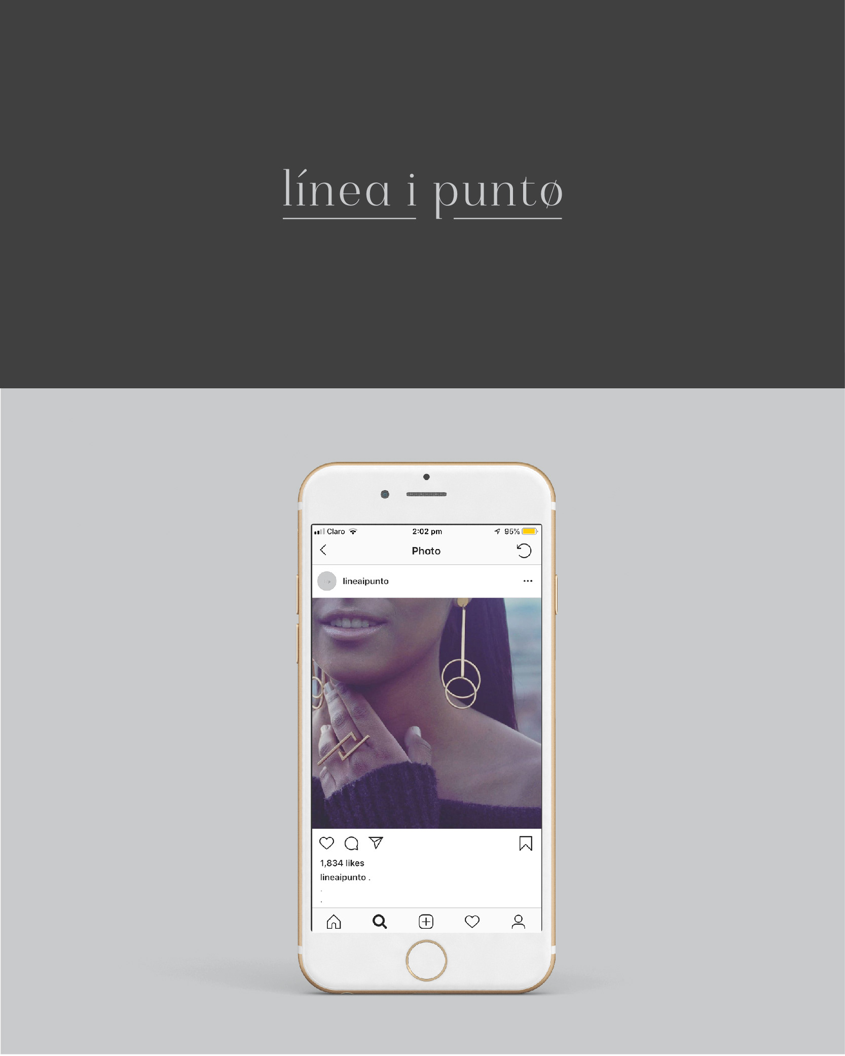
Línea y punto
2018
-
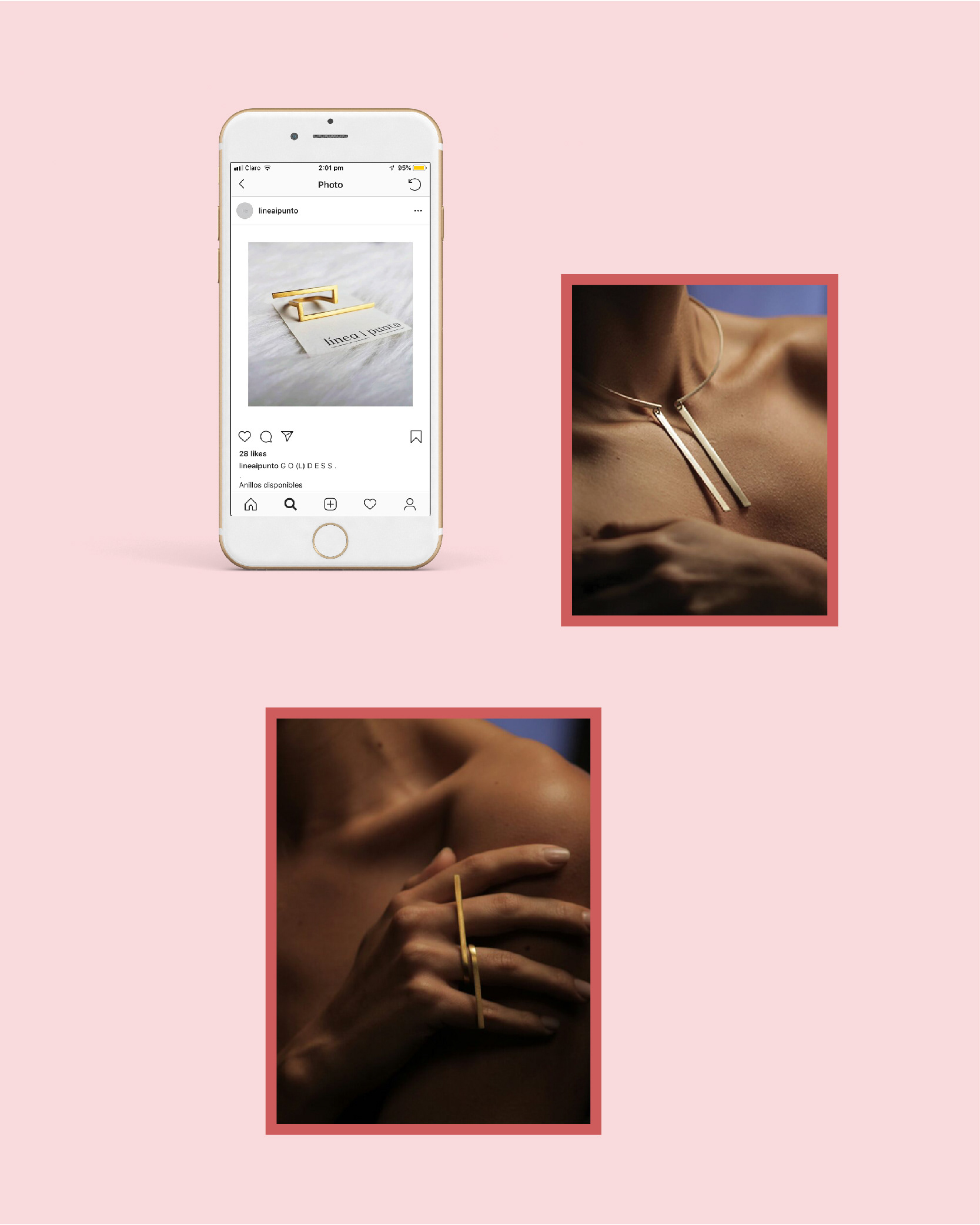
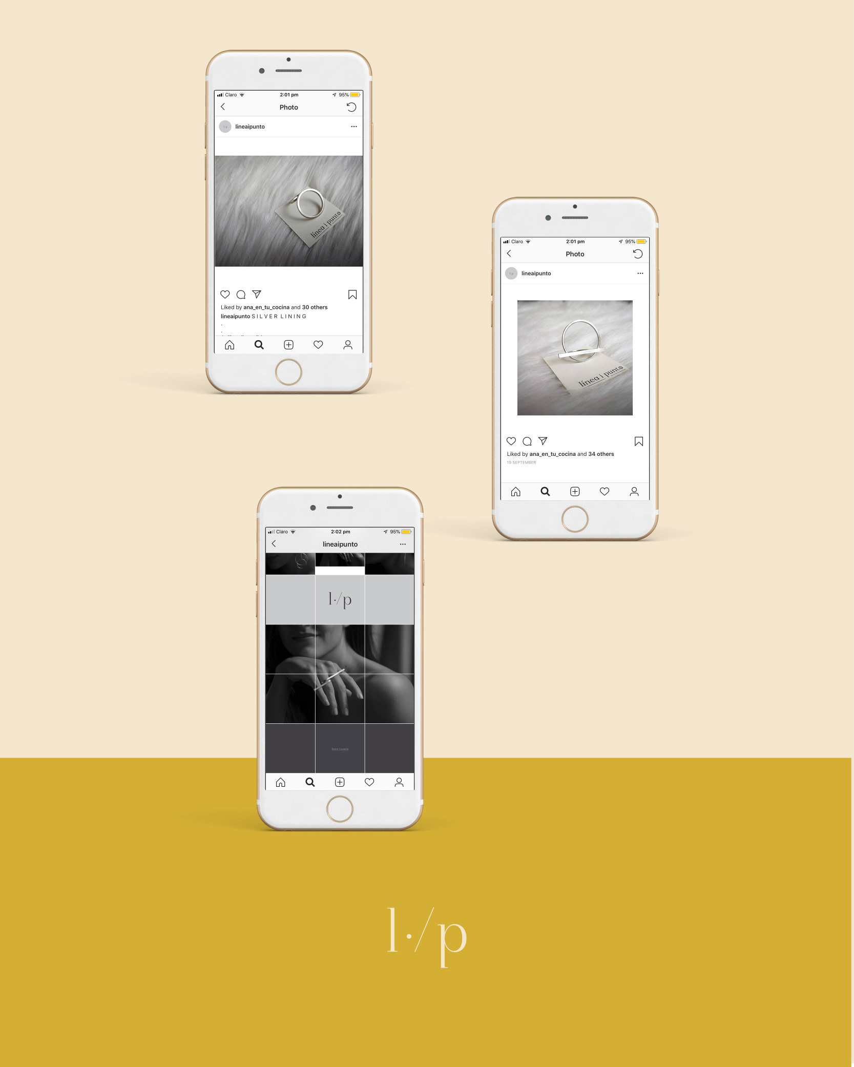
Línea y punto is jewelry brand. The creative concept plays with the contrast between the natural and organic forms and the geometrical forms. The brand also uses the relation between the body and the ornaments as a creative trigger.
The visual brand was built thinking about the subtlety, rawness and pureness of the silver material, its colors and the forms of the jewelry. The result was a typographical logo that uses small details in some of the letters, turning them into ornaments. The ornaments are the central axis of the brand, which could be used as a decorative, and constructive elements of any graphics and strategy piece. The typography keeps classic features, san-serif, but with contemporary base, very thin and straight.